
Colour grading in videography: a practical guide
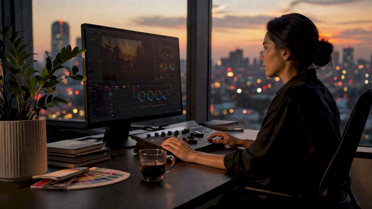
TL;DR:
Colour grading adjusts video footage’s colors, tones, and contrast to create mood and emotional impact. It is distinct from colour correction, which addresses technical issues first, and must be done sequentially. Using scopes ensures precise technical decisions, and protecting skin tones maintains natural-looking footage.
Colour grading in videography is the creative process of stylistically adjusting the colours, tones, and contrast of video footage to shape mood, atmosphere, and emotional impact. It is distinct from colour correction, which fixes technical problems like exposure and white balance. Grading is where your footage stops looking like raw camera output and starts feeling like a film. Effective grading can increase viewer emotional engagement by up to 25%. That single figure explains why professional videographers treat grading as a storytelling tool, not a finishing touch.
What is colour grading in videography and how does it differ from correction?
Colour correction and colour grading are two separate phases in post-production, and confusing them is the most expensive mistake a beginner can make. Colour correction is a technical process that balances exposure, white balance, and contrast to produce accurate, neutral footage. Grading then takes that neutral base and applies a creative look, a warm golden tone for romance, a cool desaturated palette for tension, or a high-contrast cinematic style for drama.
The sequence is non-negotiable. You correct first, then grade. Applying a creative look to uncorrected footage produces unpredictable colour shifts that no amount of tweaking will fully fix. Think of correction as building a level floor. Grading is the interior design you layer on top.
Tools used in colour correction
Scopes are the professional’s best friend during the correction phase. The Waveform monitor shows luminance levels across the frame, making it easy to spot clipped highlights or crushed shadows. The Vectorscope confirms that skin tones sit on the correct axis, regardless of what your monitor looks like. Scopes produce consistent results across different displays in a way that trusting your eyes alone never will.
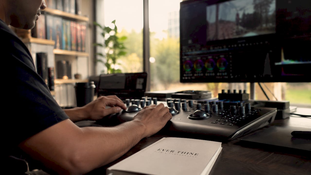
Pro Tip: Never judge colour by eye during correction. Calibrate your monitor and use scopes for every technical decision. Your monitor may be slightly warm or cool, and that bias will skew every choice you make.
Phase | Purpose | Tools |
Colour correction | Fix exposure, white balance, and consistency | Waveform, Vectorscope, RGB Parade |
Colour grading | Add mood, style, and emotional tone | LUTs, colour wheels, curves, nodes |
How does the colour grading process work in practice?
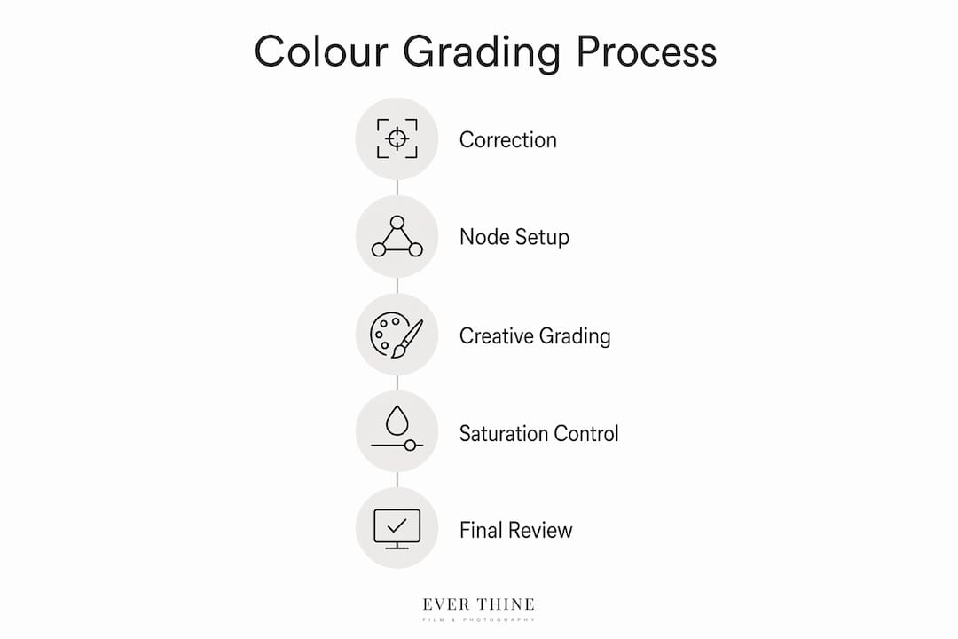
The colour grading process follows a clear sequence. Skipping steps creates problems that compound later. Here is how a professional workflow runs from raw footage to a finished grade.
Import and organise footage. Bring all clips into your editing suite and group them by scene or camera angle. Consistency across a sequence is far easier to manage when your timeline is tidy before you touch a single colour control.
Apply colour correction on a dedicated node or layer. In a node-based program like DaVinci Resolve, create a correction node first. Fix exposure, set white balance, and check skin tones against the Vectorscope. This node stays separate from everything that follows.
Apply a LUT as a starting point for your grade. A LUT (Look-Up Table) is a preset that maps input colours to output colours. Professionals rarely apply LUTs at full strength; the standard practice is to reduce LUT opacity to between 30% and 80% for a natural result. A LUT at 100% opacity almost always looks overdone.
Refine with colour wheels and curves. Adjust shadows, midtones, and highlights individually. Curves give you surgical control over specific tonal ranges. This is where you push the grade toward your intended mood.
Check consistency across shots. Grade one hero shot, then match every other clip in the scene to it. Use the Parade scope to confirm that luminance levels align across cuts.
Use adjustment layers for non-destructive edits. Applying grading effects to adjustment layers rather than base footage means you can change intensity or remove the grade entirely without touching the original clip.
Professional node-based workflows separate technical correction and creative grading on different nodes. That separation gives you precise control and prevents one phase from contaminating the other.
Pro Tip: Switch your 3D LUT interpolation from Trilinear to Tetrahedral in DaVinci Resolve’s settings. Tetrahedral interpolation produces smoother gradients and eliminates the colour banding that Trilinear can introduce in subtle tonal transitions.
What colour grading techniques enhance storytelling?
Colour grading is a narrative tool, not a cosmetic one. The palette you choose tells the audience how to feel before a single word of dialogue is spoken. These techniques give you direct control over that emotional signal.
Using colour palettes to set mood
Warm tones, amber, gold, and orange, evoke nostalgia, comfort, and intimacy. Cool tones, teal, blue, and grey, suggest distance, tension, or melancholy. A wedding film benefits from warm highlights and soft shadows. A thriller demands the opposite. The key is choosing a palette deliberately and applying it consistently across every shot in a scene.
Complementary colour schemes, where opposing colours on the colour wheel appear together, create visual tension that keeps viewers engaged. The teal-and-orange grade popular in cinema works precisely because skin tones are naturally orange, and teal is their direct complement. The contrast is pleasing without feeling artificial.
Controlling saturation and contrast
Saturation and contrast are the two levers that most directly affect how a grade reads emotionally. High saturation with lifted blacks creates a vibrant, commercial look. Low saturation with crushed blacks produces a moody, filmic feel. Contrast controls perceived depth. A flat, low-contrast image feels documentary and intimate. A high-contrast image feels cinematic and dramatic.
Avoid pushing saturation uniformly across the whole image. Selective saturation, boosting skin tones while keeping backgrounds muted, draws the viewer’s eye to the subject and prevents the frame from feeling garish.
Protecting skin tones
Skin tones are the most scrutinised element in any grade. Viewers notice unnatural skin before they notice anything else. Use the Vectorscope’s skin tone line as your reference point and protect that range when applying broad colour shifts. Consistent skin tones across shots are the mark of a professional grade. Inconsistency signals amateur post-production immediately.
Use qualifier tools to isolate skin and grade it separately from the background.
Avoid pushing green or magenta into skin tones, as both read as illness or artificiality.
Match skin tones across cameras before applying any creative look, especially when cutting between different camera models.
Keep shadow detail in faces. Crushing blacks in a portrait shot loses texture and depth.
Apply cinematic storytelling techniques to your colour choices, not just your edit structure.
How do you avoid the most common colour grading mistakes?
Most grading errors come from rushing the process or skipping foundational steps. These are the mistakes that appear most often in beginner work, and the fixes are straightforward once you know what to look for.
Grading before correcting. Skipping colour correction before grading is the single most common beginner mistake. A creative LUT applied to footage with a colour cast will amplify that cast, not hide it. Always correct to a neutral baseline first.
Applying LUTs to raw or log footage without a transform. Log footage is flat by design. It needs a colour space transform before a standard LUT will behave correctly. Skipping this step produces washed-out or oversaturated results that no amount of adjustment will fix cleanly.
Trusting the monitor over scopes. RGB Parade and Vectorscope readings are objective. Your monitor is not. A monitor that is slightly too bright will cause you to underexpose your grade. A monitor with a warm bias will cause you to overcorrect toward cool tones. Use scopes for every technical decision.
Overusing effects for a stylised look. Heavy vignettes, extreme colour shifts, and maximum contrast all read as amateur when overdone. The best grades are the ones viewers feel without noticing. Subtlety is a skill, and it takes practice to develop.
Inconsistent grading across a sequence. Matching shots within a scene is as important as the grade itself. A beautiful look applied inconsistently across cuts is more distracting than a simple grade applied uniformly. Build a matching workflow into every project from the start.
Destroying the grade by not working non-destructively. Grading directly on base footage means every change is permanent. Use nodes, adjustment layers, or non-destructive editing methods so you can revisit and revise without starting over.
Key takeaways
Colour grading transforms technically correct footage into emotionally resonant film by applying deliberate colour choices that guide audience perception and unify visual style.
Point | Details |
Correct before you grade | Always fix exposure, white balance, and consistency before applying any creative look. |
Use scopes, not just your monitor | Waveform and Vectorscope readings give objective data that monitor visuals cannot match. |
Reduce LUT opacity | Apply LUTs at 30%–80% strength for natural results; full opacity almost always looks overdone. |
Protect skin tones | Isolate and grade skin separately to maintain natural, consistent tones across every shot. |
Work non-destructively | Use nodes or adjustment layers so every grading decision remains editable and reversible. |
Why colour grading changed how I think about filmmaking
The first time I genuinely understood colour grading, I was not watching a tutorial. I was watching a wedding film back with a couple and seeing their faces change when the grade shifted from flat, corrected footage to the warm, cinematic version. That moment made it clear. Grading is not a technical step. It is the emotional layer that makes footage feel like a memory rather than a recording.
The biggest lesson I have learned is patience with the correction phase. Beginners want to skip to the creative part, and I understand that impulse. But a shaky correction foundation makes every grading decision harder. Spend twice as long on correction as you think you need to. The grade will reward you for it.
Experimenting with colour palettes is where the real learning happens. Try grading the same clip three different ways: warm and lifted, cool and desaturated, high contrast and punchy. You will see immediately how profoundly colour shapes the viewer’s emotional response. That understanding is what separates a technically competent editor from a storytelling-focused videographer. The tools matter far less than the intention behind them.
— Ever
How professional colour grading shapes a wedding film
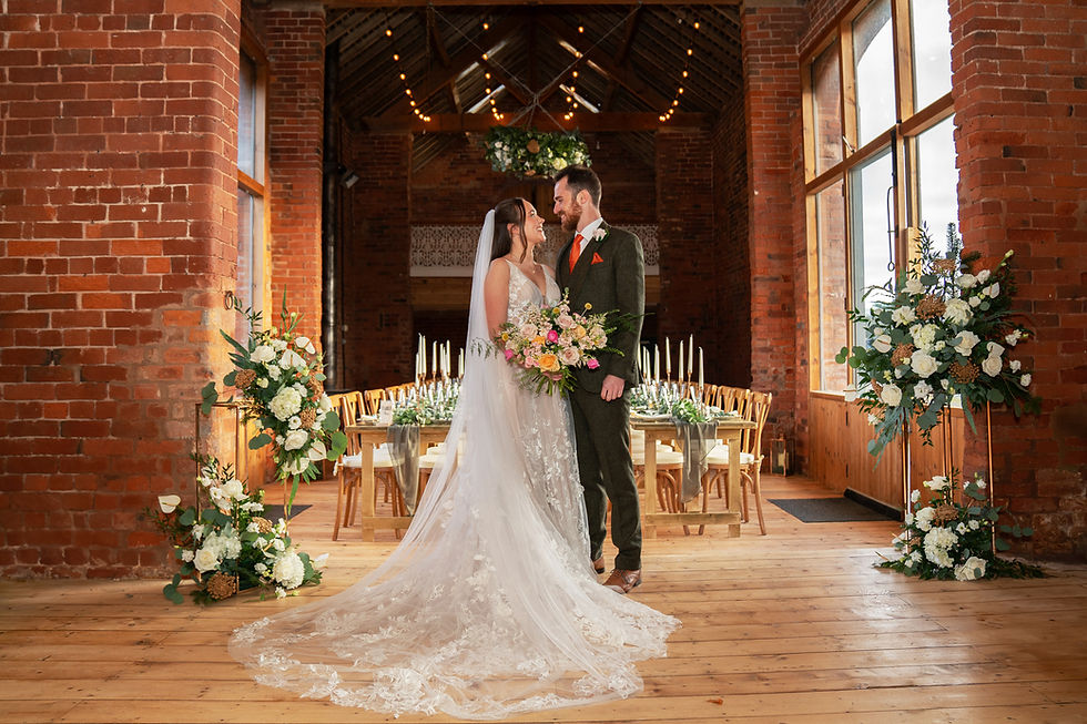
Every wedding film Weddingfilmphotography produces goes through a careful grading process that treats colour as part of the story, not an afterthought. The warmth in a ceremony shot, the soft contrast in a first dance, the lifted shadows in a candid moment: each choice is deliberate and matched across every camera used on the day.
[
If you are planning a wedding in the Midlands and want a film that feels as emotional as the day itself, Weddingfilmphotography offers cinematic wedding videography in Derbyshire with post-production that includes full professional colour grading. The result is a film you will still want to watch in twenty years. Get in touch to discuss your date and see the full portfolio.
FAQ
What is colour grading in videography?
Colour grading is the creative post-production process of adjusting the colours, tones, and contrast of video footage to establish mood, style, and emotional impact. It follows colour correction and transforms neutral footage into a visually intentional film.
What is the difference between colour correction and colour grading?
Colour correction fixes technical issues like exposure and white balance to produce accurate, neutral footage. Colour grading then applies a stylised look to that corrected base to create a specific mood or atmosphere.
Do I need special software to colour grade video?
DaVinci Resolve is the industry-standard program for professional colour grading and is available in a free version with extensive grading tools. Most non-linear editing suites also include basic colour grading features suitable for beginners.
What is a LUT and how do I use it correctly?
A LUT (Look-Up Table) is a preset that maps input colours to specific output colours, acting as a starting point for a grade. Apply it at 30%–80% opacity on corrected footage for natural results, never at full strength on raw or uncorrected clips.
How do scopes help with colour grading?
Scopes like the Waveform, Vectorscope, and RGB Parade provide objective colour and luminance data that your monitor cannot reliably show. They are the only accurate way to confirm consistent exposure and skin tones across different viewing devices.
Recommended


Comments